Brand Story
Brand Story
Brand symbol
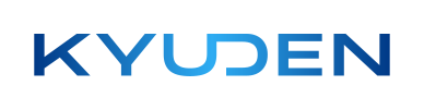
The symbol's wide, grounded, linear form—together with the curved form at center—expresses the reliability, strength, and humanity of the Kyuden Group. At the central junction, the interlocking "U" and "D" symbolize the bonds within the group and with every person we work alongside. The two letters meet at the center: one upright, one turned on its side to form the D. This meeting symbolizes how employees across the group, with their diverse values and backgrounds, come together to co-create across boundaries. This connection also illustrates a bridge between present and future.
Gradient
The blue, growing brighter toward the center, symbolizes how the connections created by the Kyuden Group will continue to illuminate the present and light the way into the future. The light blue at the center represents an ever-flowing source of new ideas and new ventures. The range of blue tones across the logo reflects the breadth of talent within the Kyuden Group and the distinctive character of each individual.